
It’s a story every online merchant knows all too well. A shopper loves your product, adds it to their cart, gets all the way to the finish line... and then vanishes. Learning how to reduce cart abandonment is about understanding why they leave and turning that leaky bucket into a major source of growth.
Why Shoppers Disappear Before Checkout
This isn't just a small leak; it's a flood. And it's hitting your bottom line directly.
Globally, about seven out of ten online shopping carts are left behind. Let that sink in. For every 100 people who show you they want to buy something, roughly 70 of them walk away. According to research from the Baymard Institute, this adds up to an eye-watering $260 billion in recoverable sales lost every single year.
We're not just talking about casual window shoppers who were never serious. Many of these customers were genuinely ready to click "buy." The problem is, something in those final moments created just enough friction or doubt to kill the momentum.
The Real Reasons Customers Leave
It’s easy to write these shoppers off as indecisive, but the real reasons for abandonment are usually far more specific—and thankfully, fixable. They almost always come down to a few key user experience roadblocks that trip people up right at the payment stage.
Think of it this way: your product pages and marketing get the customer excited. They're emotionally invested. But the checkout page? That's where the logical, practical side of their brain kicks in to evaluate the total cost, the effort involved, and whether they can trust you with their money.
So, what are the most common deal-breakers?
- Surprise Costs: This is the big one. Unexpectedly high shipping fees, taxes, or other charges appearing at the last second is the number one reason people bail.
- A Clunky Process: A long, confusing, or glitchy checkout is a conversion killer. If you're asking for their life story just to buy a t-shirt, you're going to lose them.
- Forced Account Creation: Nobody wants to create yet another password they'll forget. Making it mandatory to sign up before buying is a massive barrier.
- Lack of Trust: If your checkout page looks unprofessional or is missing basic security badges, customers won't feel safe handing over their credit card details.
- Limited Payment Options: People want to pay how they want to pay. Not offering popular options like PayPal, Apple Pay, or Buy Now, Pay Later services can turn away a huge chunk of your audience.
Getting a handle on these friction points is the first step to winning back lost sales. When you address the root causes of abandonment, you’re not just plugging a hole in your funnel; you're building a fundamentally better customer experience from the ground up.
Before we jump into the fixes, it's crucial to see these issues as opportunities. Every abandoned cart is a piece of data telling you where you can improve. Tackling these problems is a core part of learning how to improve ecommerce conversion rates and building a healthier business.
Let’s break down the common culprits and their fixes.
Common Checkout Problems and How to Fix Them
Here's a quick look at the top issues that make shoppers leave during checkout, paired with straightforward actions you can take today.
Think of this table as your checkout audit checklist. Fixing even one or two of these common pain points can have a massive impact on your conversion rates.
In the sections ahead, we’ll dive deeper into actionable strategies for each of these common issues.
Design a Frictionless Checkout Experience
Your checkout page is the last hurdle standing between a window shopper and a paying customer. You can think of it as the final handshake; a clumsy, complicated process will make them second-guess the entire deal. After all the work you've put into getting them this far, a long or confusing checkout is one of the fastest ways to lose a sale.
Let's make it effortless.

Embrace the Power of Guest Checkout
One of the biggest friction points I see time and again is forcing customers to create an account before they can buy anything. For a first-time buyer, it feels like a big, unnecessary commitment when all they want is to complete their purchase and get on with their day.
Forcing account creation is a massive conversion killer. In fact, about 24% of shoppers say they've abandoned a cart for this exact reason. This gets even worse on mobile, where abandonment rates can climb as high as 86%, making a quick, painless checkout absolutely critical.
The solution couldn't be simpler: always offer a guest checkout option. Let them complete their purchase first. Then, on the order confirmation page, you can offer them the chance to save their details by creating an account. The pressure is off, the sale is made, and they're far more likely to do it.
Trim Down Your Forms
Every single field in your checkout form is a tiny hurdle for your customer. The more hurdles you put in their way, the more likely they are to just give up and leave. Your goal should be to ask for the absolute bare minimum of information needed to process the order.
Take a hard look at your current forms. Do you really need their phone number if it’s not a freight shipment? Is a "company name" field necessary for every single customer? Probably not.
Here’s how to simplify things:
- Ditch optional fields: If it's not required, get rid of it.
- Use a single "Full Name" field: Don’t make people tab between first and last names.
- Auto-fill city and state: Let the customer enter their zip code and have the form populate the rest.
- Default to same shipping and billing: Use a simple checkbox to let users enter a different shipping address only if they need to.
Think like a minimalist. Your motto should be: "If I don't absolutely need this to fulfill the order, I won't ask for it." This simple shift in mindset can dramatically improve your completion rates.
Speed Up the Process with Smart Features
Beyond just shortening your forms, you can lean on technology to make the checkout feel faster and more intuitive. Little conveniences add up to a much smoother experience, which means a customer is less likely to get frustrated and bail.
A few smart features can make a huge difference:
- Address Auto-Completion: Tools like Google's Places API can suggest and complete a customer’s address as they start typing. This not only saves precious seconds but also cuts down on typos and delivery errors.
- Social Logins: Letting customers sign in with their Google, Facebook, or Apple accounts is a great alternative to traditional account creation. One less password for them to remember.
- Clear Visual Progress: If your checkout has multiple steps, use a progress bar (e.g., Shipping > Billing > Review). This sets expectations and shows customers exactly how close they are to the finish line, which can be a powerful motivator.
These kinds of optimizations are central to building a better customer journey. It goes beyond just the checkout, too—learning how to improve your overall ecommerce conversion rates will give you a broader perspective on keeping shoppers engaged from start to finish.
Optimize Your Checkout Flow
Once you’ve simplified the inputs, think about the overall layout and flow. You're guiding the user through a critical final step, so clarity is everything. While there are a few different philosophies on how to structure a checkout page, the goal is always the same—make it as easy as possible to pay.
A modern, well-designed checkout is more than just a form; it's a key part of your brand experience. Platforms like Shopify offer highly optimized flows right out of the box, but there are always opportunities to refine things further. You can learn more about crafting a high-converting experience by exploring our guide on checkout optimization.
Ultimately, designing a frictionless experience means removing every single obstacle that stands between your customer and that "Complete Purchase" button.
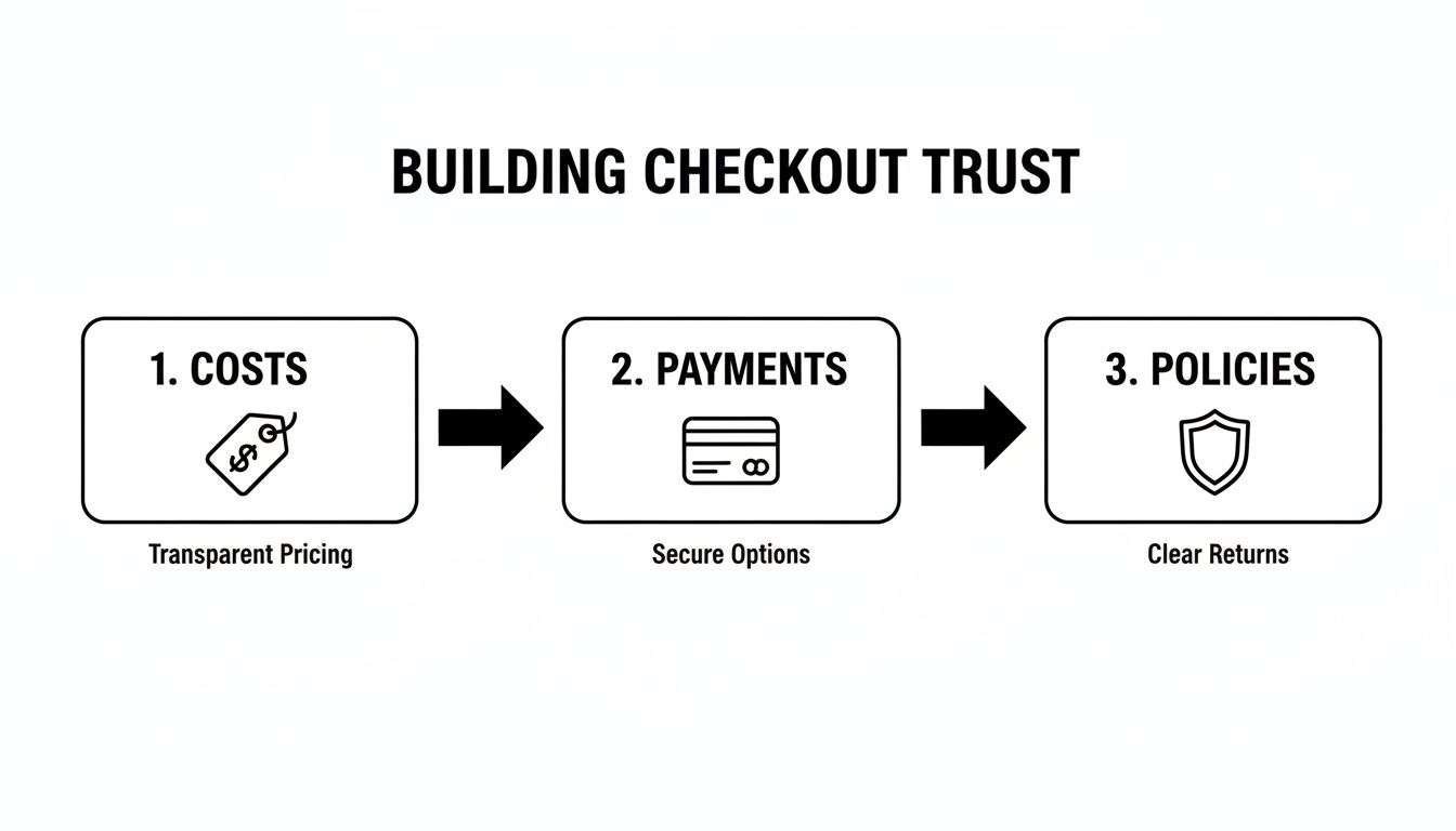
Build Trust with Clear Pricing and Secure Payments
Nothing tanks a sale faster than a last-minute surprise. Imagine your customer is excited, they’re ready to buy, and then they hit the final checkout step only to see an unexpected shipping fee that sends the total price soaring. In an instant, that trust is broken, and the "Complete Purchase" button becomes a landmine they’d rather avoid.
This isn't a minor hiccup; unexpected costs are the #1 reason people abandon their shopping carts. The fix isn’t about hiding fees better—it's about being radically transparent from the moment they add an item to their cart.
When you're upfront about all costs, you’re treating your customers with respect. It’s a simple act that builds a foundation of trust and gives them the confidence they need to click "buy."
Eliminate Sticker Shock with Upfront Pricing
The absolute worst place for a customer to discover shipping costs is on the final payment screen. It feels like a bait-and-switch, even if you didn't mean it that way. To get around this, you have to weave pricing information into the shopping journey much, much earlier.
Here are a few practical ways to do it:
- Add a Shipping Calculator: Pop a simple tool right on the cart page. Let customers punch in their zip code to get an instant shipping estimate before they even think about checking out.
- Use a Free Shipping Banner: If you offer free shipping (say, on orders over $75), make it impossible to miss. A site-wide banner at the top of every page works wonders.
- Be Clear on Product Pages: A quick note about potential shipping costs or a direct link to your shipping policy right in the product description can prevent a lot of headaches later.
Being honest about the full price—taxes and all—before that final step is one of the most powerful ways to show customers you value their business. This transparency is a cornerstone of any effective cart abandonment strategy.
Your goal should be to make the price a customer sees in their cart as close as humanly possible to the final price they'll pay. No surprises means fewer reasons to leave.
Offer a Buffet of Payment Options
In today's world, a "credit card only" approach just doesn't fly. Shoppers have their go-to payment methods, and not offering their favorite one is like putting a "closed" sign on your door for a huge chunk of your audience. Think of payment options as another form of convenience and trust-building.
A modern storefront needs to offer a healthy mix of payment types to make everyone feel at home.
The Essential Payment Methods You Should Offer:
- Credit & Debit Cards: This is table stakes. Visa, Mastercard, and American Express are non-negotiable.
- Digital Wallets: This is where the magic happens for quick checkouts. PayPal, Apple Pay, and Google Pay are must-haves, especially for mobile shoppers who absolutely hate typing in their card details on a tiny screen.
- Buy Now, Pay Later (BNPL): Services like Klarna, Afterpay, or Affirm have exploded in popularity. They let customers break up their purchase into smaller, often interest-free payments, which can be a game-changer for converting sales on higher-priced items.
By offering this kind of flexibility, you're sending a clear message: "We'll make it easy for you to buy, however you want." It’s a customer-first mindset that makes checking out feel seamless instead of restrictive.
Display Trust Signals Loud and Clear
When a shopper lands on your checkout page, they're subconsciously asking one critical question: "Is it safe to type my credit card number in here?" You need to answer that with a resounding "YES!" using clear, visual proof.
These little badges and icons are like a security blanket, reassuring customers that their personal and financial info is locked down tight.
Make sure your checkout page prominently features:
- Security Seals: Logos from known security companies like McAfee, Norton, or GeoTrust immediately signal that you take security seriously.
- SSL Certificate: That little padlock icon in the browser's address bar is a must. It’s the universal sign of a secure, encrypted connection.
- Payment Logos: Simply showing the logos of the payment methods you accept (Visa, PayPal, etc.) adds another layer of legitimacy.
- Clear Return Policy: Don't bury your return policy. Linking to a straightforward, easy-to-read policy reduces the perceived risk of buying.
These small visual elements have a massive psychological impact. On the backend, it's just as important to ensure your payment processing is rock-solid. Many platforms now use protocols like 3-D Secure to add an extra layer of fraud prevention. You can learn more about what 3-D Secure authentication is and see how it protects both you and your customers. This dedication to security is a vital piece of the puzzle.
Win Back Customers with Smart Cart Recovery
Just because a shopper clicks away doesn't mean the sale is lost forever. It's better to think of an abandoned cart not as a failure, but as a hot lead. They were this close to buying. A well-timed, automated recovery campaign can bring a surprising number of these almost-customers back to finish what they started.
The trick is to act fast and make it personal. A generic "you left something" email sent a week later just won't cut it. Your goal is a gentle, helpful reminder that feels more like good customer service than a desperate sales pitch. With the right timing and message, you can turn a moment of hesitation into a completed purchase.
The Power of Abandoned Cart Emails
Abandoned cart emails are hands-down your best tool for clawing back lost sales. The data is clear: emails sent within the first hour of abandonment have the highest open and conversion rates. If you wait too long, that initial excitement to buy fades, or worse, they find what they wanted from a competitor.
But the most effective emails do more than just remind. They use personalization to reconnect the shopper with the exact items they were considering.
- Show, Don't Just Tell: Always include high-quality images of the products left behind. Seeing that specific jacket is a much stronger nudge than just reading its name in a line of text.
- Make it Obvious: Use a big, bold call-to-action (CTA) button with an urgent but friendly message like "Return to Your Cart" or "Complete Your Purchase." You want to make it incredibly easy for them to pick up right where they left off.
- A Light Touch of Scarcity: If an item is almost out of stock, a simple "Only 3 left!" can create a genuine sense of urgency. Just be careful here—fake scarcity is a quick way to kill trust if customers catch on.
Of course, the best recovery strategy starts by preventing abandonment in the first place. Being upfront about costs, payments, and policies is foundational.
This process really drives home how crucial it is to build trust before they even think about leaving. Clear pricing, plenty of payment options, and an easy-to-find return policy can stop a lot of carts from ever being abandoned.
Crafting an Effective Recovery Sequence
One email is good, but a sequence is better. A multi-step "drip" campaign lets you follow up a few times without being annoying. Spacing out your messages gives you more chances to catch the customer at just the right moment.
Think of your recovery sequence as a conversation. The first email is a helpful reminder. The second might offer assistance. The third could provide that final nudge to seal the deal.
For a deeper dive into the specific tactics that work, these powerful shopping cart abandonment solutions offer some proven strategies for recovering sales.
A smart sequence is a game-changer. Here’s a simple, effective model you can adapt for your own store.
A Simple Abandoned Cart Email Sequence
This three-part structure covers the key touchpoints—an initial reminder, a helpful follow-up, and a final incentive—to maximize your chances of winning back that sale.
Should You Offer a Discount?
Ah, the million-dollar question. It's tempting to lead with a discount, but be careful. You can accidentally train savvy shoppers to abandon carts on purpose just to snag a coupon.
A much better approach is to hold that discount for a later email in your sequence.
For instance, your second or third email could include a time-sensitive offer like, "Complete your purchase in the next 24 hours and get 10% off." This creates real urgency and is often the final push a price-conscious shopper needs to commit.
Don't Forget About SMS Recovery
Email might be king, but SMS is the powerful queen right beside it. With so much shopping happening on mobile, text message recovery is becoming essential.
Texts have an absolutely massive open rate—often over 90% within just a few minutes. That makes them perfect for quick, time-sensitive nudges.
Keep your SMS messages short and sweet. Something like, "Hey [Name]! Looks like you left something great in your cart at [Your Store Name]. Your items are saved for you here: [Link]" can work wonders. The one major rule: make sure you have explicit consent from customers before you start sending marketing texts.
By combining timely emails, a smart discount strategy, and direct SMS nudges, you can build a powerful system that works around the clock to bring customers back and seriously cut down your cart abandonment rate.
Use On-Site Tactics to Prevent Abandonment
While smart recovery campaigns are essential for clawing back lost sales, the best offense is a good defense. The real magic happens when you can stop abandonment before it even starts.
By using a few proactive, on-site tactics, you can address a shopper’s hesitation in real time—right at that critical moment before they decide to leave. Think of these strategies as a final, helpful nudge to guide them over the finish line.
It’s the digital equivalent of a sharp retail employee noticing a customer about to walk out. They might ask, "Did you find everything okay?" or point out a special offer. On-site tools give you that same power, just online.
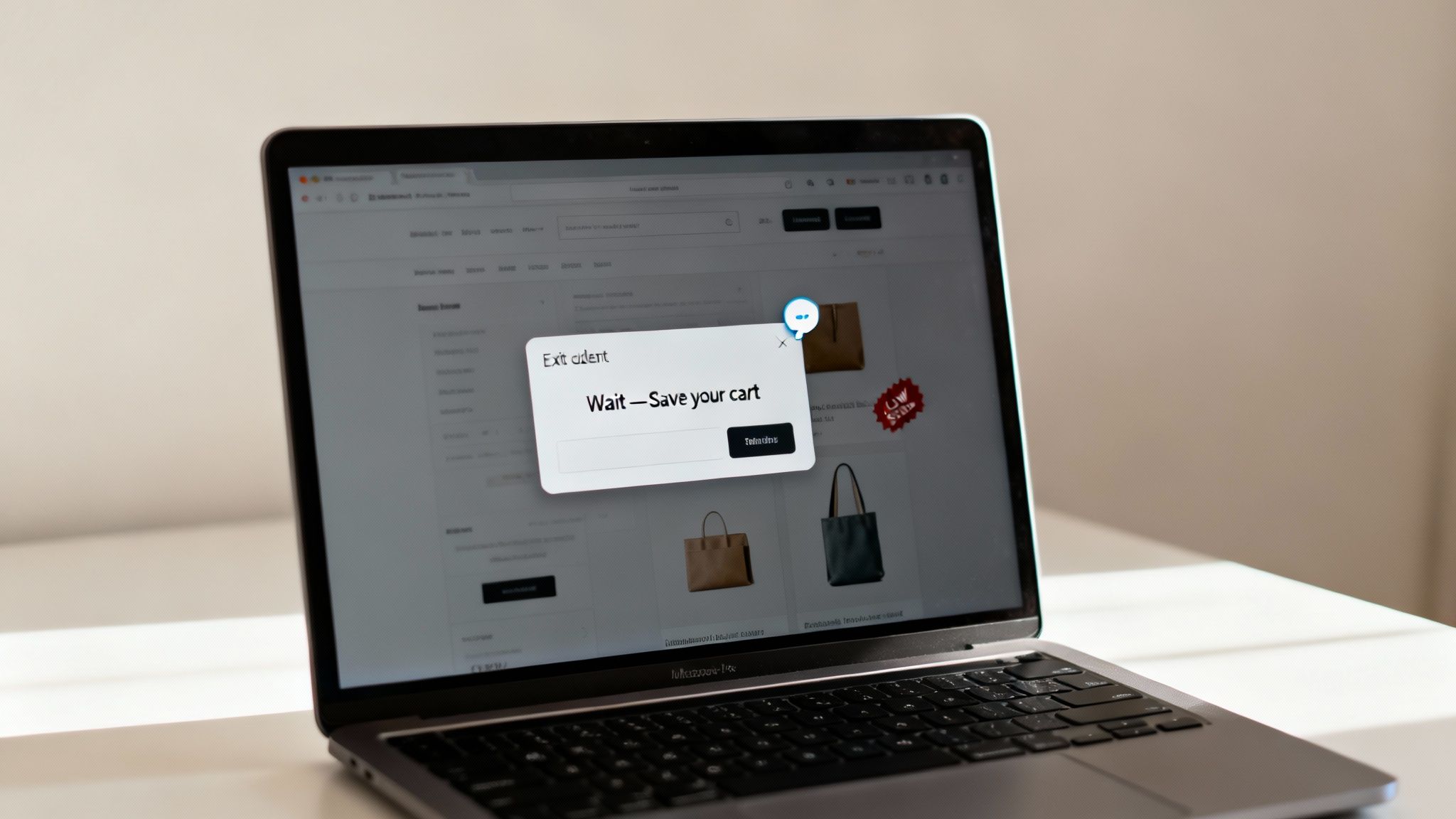
Catch Hesitant Shoppers with Exit-Intent Popups
One of the most powerful tools in your on-site arsenal is the exit-intent popup. This clever tech tracks a user's mouse movements and triggers a message the second their cursor drifts toward the back button or to close the tab. It’s your last-ditch effort to grab their attention before they vanish.
But a good exit-intent popup isn't pushy. It should feel genuinely helpful.
Here are a few ways to use them that actually work:
- Offer a Last-Minute Discount: A simple, "Wait! Get 10% off your order if you complete your purchase now," can be ridiculously persuasive.
- Provide a Free Shipping Code: Since unexpected shipping costs are the number one cart-killer, offering free shipping can instantly remove that barrier.
- Save Their Cart: Sometimes, people just aren't ready to pull the trigger. Offering to email them their cart for later makes it easy to come back. Plus, you get their email for follow-up campaigns.
The key is to offer real, tangible value. A generic "Don't Go!" message is just noise. An incentive that solves a real problem? That’s what converts. When done right, these popups can recover a surprising chunk of would-be abandoned carts.
Build Confidence with Live Chat and Social Proof
Doubt is a massive conversion killer. If a shopper has a last-minute question about sizing, shipping times, or your return policy and can't find an answer right now, they’re gone. A live chat widget is the perfect antidote.
Putting a chat option on your cart and checkout pages provides instant reassurance. Even if they don't use it, just seeing the option for immediate support boosts their confidence in your brand. Great user experiences often come down to this kind of proactive support; you can even connect with UX researchers from our global community to get deeper insights into what makes customers feel secure.
Another powerful confidence booster is social proof. This is just the simple psychological fact that people are more likely to do something if they see others are doing it too.
By showing shoppers that other people are actively buying from your store, you create a sense of trust and popularity. It subtly tells them, "This is a safe and popular place to shop."
You can sprinkle social proof across your site in a few ways:
- Recent Purchase Notifications: Those little popups saying, "Someone in New York just bought the Classic Leather Jacket," make your store feel busy and credible.
- Customer Reviews: Displaying star ratings and glowing reviews directly on product and checkout pages reinforces that they're making a solid choice.
- "Best-Seller" Badges: Highlighting popular items creates a sense of demand and helps guide uncertain shoppers toward a product others already love.
Create Ethical Urgency and Scarcity
Finally, you can give shoppers a gentle nudge by introducing a bit of urgency or scarcity. This taps into the classic fear of missing out (FOMO) and prompts people who are "on the fence" to commit.
The keyword here, however, is ethical. Fake scarcity—like a countdown timer that magically resets every time you refresh the page—is a great way to destroy your credibility.
Here are two honest ways to apply this principle:
- Low-Stock Alerts: If a product genuinely is running low, display a message like "Only 3 left in stock!" This is just helpful information that allows the customer to make a timely decision.
- Countdown Timers for Sales: Timers work beautifully for legitimate promotions, like "Your 20% off code expires in 15:00." This is perfect for flash sales or holiday deals and creates a clear, honest deadline.
By layering these on-site strategies, you can build a supportive and persuasive environment that keeps more customers on the path to purchase and seriously cuts down your cart abandonment rate.
Your Top Cart Abandonment Questions, Answered
When you're running an e-commerce store, you start to see the same questions pop up again and again around shopper behavior. Let's tackle some of the most common concerns store owners have when they start digging into how to lower their cart abandonment.
What Is a Good Cart Abandonment Rate, Anyway?
You’ll hear the industry average is a pretty scary 70%, but honestly, a "good" rate depends entirely on your business. What you sell, your price point, and your industry all play a huge role.
For most stores, just getting that number below 60% is a fantastic first milestone to celebrate. The real pros, especially brands with a die-hard following, can sometimes pull it down to 50% or even lower.
The key is to stop chasing some magic number. Instead, focus on tracking your own rate and making steady, incremental improvements. If you can chip away at it month after month, you’re winning.
How Do I Calculate My Cart Abandonment Rate?
Figuring this out is simpler than it sounds, and it's one of the most important health metrics for your store. It's just a quick formula that tells you exactly how many potential sales are slipping away.
Here’s the breakdown:
- Find your total number of completed purchases.
- Divide that by the total number of shopping carts created.
- Subtract that result from 1.
- Then, just multiply by 100 to get your percentage.
(1 - [Total Completed Purchases ÷ Total Carts Created]) x 100 = Cart Abandonment Rate %
So, if 1,000 carts were created but only 300 purchases were completed, your rate would be (1 - [300 ÷ 1,000]) x 100 = 70%.
What’s the Single Most Effective Cart Recovery Tactic?
If I had to pick just one, it’s a well-timed, automated abandoned cart email sequence. There's no silver bullet, but this comes pretty close. An email that lands in their inbox within the first hour of abandonment gives you the best shot at bringing them back.
Why is it so powerful? It's personal, direct, and it catches people while the purchase is still fresh in their minds. A great sequence doesn't have to be complicated:
- Email 1 (After 1 Hour): This is a gentle nudge. Simply show them the exact products they left behind.
- Email 2 (After 24 Hours): Shift the focus to service. Offer help and maybe link to an FAQ to address common hang-ups.
- Email 3 (After 48-72 Hours): If they're still on the fence, create a little urgency with a small, time-sensitive discount.
This multi-email flow covers your bases without feeling like spam, making it an absolute powerhouse for recovering lost sales.
Should I Slap a Discount in Every Recovery Email?
It’s tempting, but no—you definitely shouldn't. If you lead with a discount every time, you’ll quickly train your savviest customers to abandon their carts on purpose just to score a coupon. That habit will eat away at your profit margins.
A better strategy is to save that discount for the final email in your sequence. Think of it as your last-ditch effort to win back shoppers who are truly hung up on price. This way, you aren't giving away margin when you don't have to, but you still have that final nudge ready when it really counts.
For more answers to your e-commerce questions, you can always check out our comprehensive FAQ page for further insights.
Are Exit-Intent Popups Just Annoying?
They absolutely can be... if they’re done badly. A popup that just screams "WAIT, DON'T GO!" is annoying because it’s disruptive and offers zero value. But a popup that offers genuine, immediate help can be an incredible conversion tool.
The trick is to make your offer solve the problem that’s causing them to leave.
If you know high shipping costs are a top reason people bail, a popup offering a free shipping code is a lifesaver. If a shopper just seems hesitant, offering to save their cart or email them a link is a helpful service. When your popup provides a solution instead of an interruption, customers see it as a benefit, not a bother.
Are fraudulent chargebacks draining your revenue and wasting your time? ChargePay uses advanced AI to automate the entire dispute process, generating winning evidence to recover your funds hands-free. Stop losing money to friendly fraud and focus on growing your business. Discover how ChargePay can boost your win rate today.


.svg)


.svg)
.svg)
.svg)