
Improving your store's conversion rate isn't about some secret trick. It's a systematic process of turning more of your hard-won visitors into paying customers. This means taking a hard look at everything from the clarity of your product pages and the speed of your checkout to building trust with real social proof and nailing the mobile experience.
Think of it as a continuous hunt for friction points in your customer's journey, then smoothing them out, one by one.
What Is a Good Ecommerce Conversion Rate?
Before you start tweaking button colors or rewriting copy, let's get one thing straight: there's no magic number for a "good" conversion rate. What's fantastic for a high-end jewelry brand could be a total disaster for a store selling everyday snacks. The right benchmark for you depends entirely on your industry, where your traffic is coming from, and even the devices people use to shop.
The real goal isn't to chase some random industry average. It's about figuring out a realistic baseline for your business and then consistently improving it. Getting this context right is the first step to diagnosing your store's health and spotting the biggest opportunities for growth.
Setting Realistic Expectations
So, what actually influences your conversion rate? A few key factors can make it swing much higher or lower than a general average.
- Your Industry: The Food & Beverage category, for example, often enjoys the highest conversion rates, sometimes topping 6%. On the other side of the spectrum, high-consideration purchases like luxury goods might hover closer to 1.19%.
- Where Traffic Comes From: A visitor who clicks a referral link from a trusted blog is practically ready to buy, leading to conversion rates as high as 5.4%. In contrast, someone scrolling through social media is usually just browsing, which is why that traffic often converts at a much lower 0.7%.
- The Device They're Using: Mobile traffic dominates most sites these days, but desktop users still tend to convert at a higher rate. This just hammers home how critical it is to perfect your mobile shopping experience.
Globally, the average ecommerce conversion rate is expected to land somewhere between 2.5% and 3.0% by 2025. That slight uptick is largely thanks to better personalization and smoother mobile checkout flows.
Ecommerce Conversion Rate Benchmarks at a Glance
Use this quick reference to see how your store's performance compares to industry averages across different categories.
These benchmarks provide essential context, helping you understand if your 1.5% conversion rate is a red flag or actually a solid starting point for your niche.
The key takeaway? Stop comparing your store to a vague global average. Start digging into what’s possible for your specific situation. Knowing where you truly stand is the foundation of any effective optimization strategy.
From here, you can begin the real work of digging into your analytics. A great place to start is to truly understand the value of user research in 2024 to see what your customers are really thinking. For a deeper dive into the tactics behind optimization, check out these great insights on maximizing your website's conversion rate.
Finding Where Your Customers Get Stuck
You can't fix a leak until you find where it’s coming from. To actually improve your conversion rate, you have to put on your detective hat and investigate your own website. This isn’t about guesswork; it’s about using real data to see exactly where potential buyers are hitting a wall and walking away.
Are they bouncing from product pages in frustration? Maybe they’re abandoning their carts the second they see the shipping costs? Without this information, any changes you make are just shots in the dark. The goal here is to build a clear, data-backed roadmap that tells you what to fix first for the biggest impact.
The reasons people drop off are often complex, and they can be influenced by everything from your industry to the specific device a customer is using.

As you can see, conversion issues can pop up at any point in the journey. What works for one store might not work for yours, which is why your own data is your most valuable asset.
Using Analytics to Uncover Bottlenecks
Your best detective tool is probably one you already have: Google Analytics. It's packed with reports that can pinpoint the exact pages where you’re losing potential customers. Instead of getting overwhelmed by all the data, let's zoom in on one key area to start: the conversion funnel.
Setting up a funnel visualization lets you map out the ideal path a customer takes, from landing on your site to checking out. This report shows you precisely how many people move from one step to the next and—more importantly—how many bail at each stage.
For instance, you might discover that:
- 90% of visitors who add an item to their cart start the checkout process.
- But only 50% of those who start checkout actually finish the purchase.
Boom. That immediately tells you the problem isn't getting people interested in your products; the real friction is happening somewhere inside the checkout flow itself. That’s your first major clue.
Visualizing the Customer Journey
The "Funnel exploration" report in Google Analytics 4 is your go-to for this kind of work. It gives you a clean, visual breakdown of how users are moving—or not moving—through the steps you’ve defined.
Once you’ve identified a problem page—let's say it's the shipping information step in your checkout—you can dig deeper. Analytics is great for telling you where they leave, but it can’t tell you why. For that, we need to bring in some other tools.
Your analytics data gives you the "what" and "where" of customer drop-offs. Heatmaps and session recordings are what give you the "why." Combining these insights is the fastest way to understand and fix the real barriers to conversion.
Seeing Your Site Through Your Customers' Eyes
To truly understand the friction points, you need to see your site the way your customers do. This is where qualitative tools like heatmaps and session recordings are absolute game-changers.
- Heatmaps: These tools create a visual overlay on your pages, showing where users are clicking, how far down they scroll, and where their cursors linger. You might find out that dozens of people are clicking on a beautiful product image that isn't actually clickable, signaling a clear design flaw.
- Session Recordings: Think of this as a DVR for your website. You can watch anonymous recordings of real users navigating your store. You'll see them hesitate, get stuck in a frustrating loop, or even rage-click on a broken button before giving up.
Watching just a few session recordings for a known problem page can provide more actionable insights than hours of staring at spreadsheets. You might spot a bug that only appears on a specific browser or realize your shipping options are just plain confusing.
Understanding these subtle user behaviors is critical. You might even want to connect with UX researchers from our global community to get an even deeper perspective.
By blending the hard numbers from analytics with the human stories from user behavior tools, you create a powerful, evidence-based strategy. You’re no longer guessing; you’re diagnosing specific problems and can now move forward to fix them with confidence.
Turn Your Product Pages into Sales Engines
Think of your product pages as your best, hardest-working salespeople. If they're vague, uninspiring, or confusing, you’ve lost a potential customer. They’ll just click away without a second thought.
This page is often the final hurdle before someone clicks "add to cart," making it one of the most critical places to focus your CRO efforts. So, let's look at how to transform these pages from simple listings into high-impact conversion tools. The goal here is to move beyond a dry list of features and start telling a story that clicks with your customer’s real-world needs.

Go Beyond Features and Sell the Benefits
It’s an old marketing saying, but it holds true: customers don't buy a drill because they want a drill; they buy it because they want a hole in the wall. This simple idea is the key to writing product descriptions that actually sell. You have to stop leading with technical specs and start highlighting what your product does for the customer.
For example, instead of saying, "This backpack is made from water-resistant nylon," try something like, "Keep your laptop and books perfectly dry on your commute, no matter the weather." The first is a feature; the second is a benefit that solves a real problem.
A few tips to make your descriptions even more effective:
- Use bullet points: Break down the core benefits into a scannable list. This helps busy shoppers quickly grasp the value.
- Speak your customer's language: Drop the jargon. Use the same words and phrases your target audience uses in reviews or on social media.
- Tell a mini-story: Frame the product in a real-world scenario. Help the customer visualize themselves using it and feeling the benefits.
This shift in focus from "what it is" to "what it does for me" is the most fundamental change you can make to create a persuasive product page.
A great product page doesn't just describe a product; it answers the customer's unspoken question: "How will this make my life better?" Nail that, and you're halfway to a sale.
The Power of High-Quality Visuals
In e-commerce, your product photos and videos have to do all the heavy lifting. Customers can't touch, feel, or try on your products, so your visuals must fill that sensory gap and build the confidence they need to hit "buy."
Grainy, low-resolution images from a single angle just won't cut it anymore. Your visual strategy needs to be more robust.
- Multiple high-resolution photos: Show the product from every conceivable angle—front, back, side, top, and even the bottom.
- In-context shots: Display the product being used. If you sell a handbag, show it on someone's shoulder to give a sense of scale and style.
- Close-up details: Zoom in on what makes it special. Think textures, stitching, or unique hardware. This is how you convey quality and craftsmanship online.
- Product videos: A short video can demonstrate functionality in a way static images never could. Show it in action to answer questions before they're even asked.
Investing in professional-quality visuals is one of the highest-return activities for boosting conversions. It builds immediate trust and helps customers feel certain about what they're buying. This certainty is crucial, as a lack of clarity is one of the top product return reasons that can eat away at your profits.
Build Unshakeable Trust with Social Proof
Let's be honest—shoppers trust other shoppers far more than they trust slick marketing copy. That's why social proof isn't just a nice-to-have; it's an essential element of a high-converting product page. Seeing that other people have bought and loved a product is often the final nudge a hesitant buyer needs.
Here’s how to effectively weave social proof into your pages:
- Customer Reviews and Ratings: This is non-negotiable. Prominently display star ratings right near the product title. Genuine reviews, including both the glowing five-stars and the constructively critical ones, build authenticity. Research shows that having reviews can increase conversion rates by as much as 270%.
- User-Generated Content (UGC): Encourage customers to share photos of themselves using your product on social media with a specific hashtag. Featuring these real-world photos on your product pages is incredibly powerful and makes your brand feel more relatable.
- Expert Endorsements or Trust Badges: Has your product won an award, been featured in a well-known publication, or met a certain quality standard (like "certified organic")? Showcase these badges clearly. They act as a third-party stamp of approval.
By layering different forms of social proof, you create a powerful sense of confidence. It makes clicking "Add to Cart" feel like a safe and smart decision, moving the purchase from a risky guess to a validated choice.
Design a Checkout Process People Actually Finish
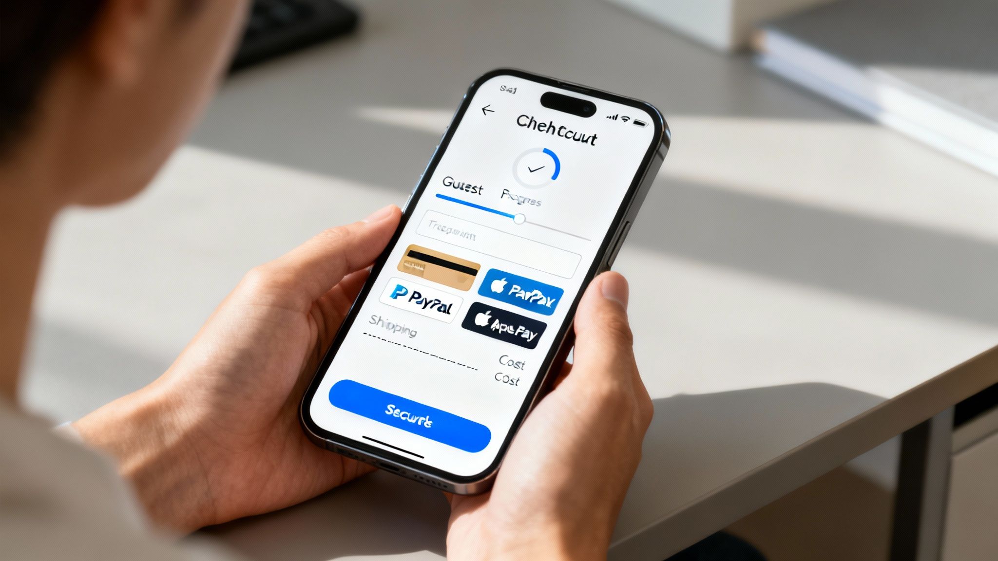
This is the moment of truth. A customer has added items to their cart, clicked "checkout," and is ready to hand over their money. A clunky, confusing, or surprising checkout flow is the fastest way to kill that momentum and lose a sale.
A checkout that feels simple, predictable, and trustworthy can slash your cart abandonment rate. This is where your CRO efforts turn directly into revenue.
Let’s break down the practical steps to make that happen.
Single Page Versus Multi-Page Checkout
The first big decision is the structure. Single-page checkouts put every field—shipping, billing, payment—on one screen. It's fast, and customers can see everything at once.
Multi-page checkouts, on the other hand, break the process into logical steps (e.g., Shipping > Payment). This can feel less overwhelming but introduces more clicks, which means more opportunities for someone to drop off.
So which is better? For most stores, a single-page flow works beautifully, if the form is short and well-organized. If you have complex shipping or require a lot of information, a multi-page approach with a clear progress bar often performs better.
Add a Guest Checkout Option
Friction is the enemy of conversion. Forcing a customer to create an account before they can buy is a massive point of friction.
Guest checkout removes that barrier. Just ask for an email and payment info to seal the deal.
- It’s Easy: When shoppers can skip the sign-up process, the path to purchase gets a whole lot shorter.
- Less Abandonment: People are far more likely to finish if they aren't bogged down with creating yet another password.
- You Still Get What You Need: You capture their email, which is all you really need to send order confirmations and follow up with marketing later on.
Offer Multiple Payment Methods
Don't assume everyone wants to pay with a Visa. Offering a variety of payment options builds trust and caters to different customer preferences, which directly lifts completed orders.
Your goal is to let people pay how they want to pay.
- Major Credit Cards: Visa, MasterCard, and Amex are the bare minimum.
- Digital Wallets: Shoppers love the one-click convenience of services like PayPal, Apple Pay, and Google Pay. They're fast and feel secure.
- BNPL Services: Options like Klarna or Afterpay can capture sales you might otherwise lose by letting customers split payments, often leading to higher average order values.
Present Costs Without Surprises
There is nothing that kills a conversion faster than a surprise fee right at the end. Sticker shock is real, and it’s responsible for a huge percentage of abandoned carts.
Transparency is non-negotiable.
- Show Shipping Costs Early: Display shipping rates or your free shipping threshold right on the product page or in the cart. Don't make them wait until the final step.
- Display Tax Estimates: Let customers see an approximation of taxes before they get to the final order review.
- Clarify Any Fees: If you have handling or service charges, explain them clearly. An icon with a simple tooltip can work wonders.
Nearly 77.2% of mobile users abandon their carts. A huge reason for this is unexpected costs. When everything is laid out transparently, customers trust the process and are far more likely to complete their purchase.
Optimize the Mobile Experience
With mobile commerce driving nearly 59% of all sales, your checkout absolutely must shine on a small screen. What works on a desktop often fails miserably on a phone.
Think big buttons, simple layouts, and less typing.
- Use Responsive Design: Every element needs to adapt perfectly to any screen size. No pinching and zooming allowed.
- Keep Key Buttons in Thumb's Reach: Place the "Continue" and "Pay Now" buttons near the bottom of the screen where they're easy to tap.
- Enable Autofill: Let browsers and digital wallets automatically fill in shipping addresses and payment details. The less a customer has to type on their phone, the better.
Recover Lost Sales with Reminders
Even with a perfect checkout, some people will get distracted. A well-timed cart recovery email can bring them right back to finish what they started.
Timing is everything. Send the first reminder within an hour, a second one after 24 hours, and a final nudge after three days.
- Use a Clear Subject Line: Something like "Did you forget something?" or "Your items are waiting for you" works well.
- Offer a Small Nudge: A small discount code (10% off) can be just the push an undecided buyer needs.
- Remind Them of the Good Stuff: Mention your free shipping, easy returns, or fast delivery perks right in the email.
A solid follow-up sequence can recover up to 20% of otherwise lost carts. That's pure profit.
Use ChargePay to Smooth Out Disputes
Nothing sours a customer relationship faster than a messy refund or dispute process. If a customer feels like they'll have to fight to get their money back after a legitimate issue, they won't buy from you again.
ChargePay helps by automating chargeback responses, which protects your revenue while ensuring customers feel heard.
You can learn more about building a seamless path in our guide on checkout flows with ChargePay. When shoppers trust that any payment hiccups will be fixed quickly and fairly, they're much more confident hitting that "buy" button.
Test and Improve Constantly
Your checkout is never truly "done." Even the most well-designed process can be improved with ongoing tweaks and tests.
A/B testing is your best friend here. Don't guess—let your customers' behavior tell you what works.
- Formulate a Hypothesis: "I believe changing the 'Pay Now' button from blue to green will increase conversions because green signals 'go'."
- Measure the Impact: Track completion rates for each version of your test.
- Roll Out the Winners: If a change produces a statistically significant lift, make it the new default.
By focusing on simplicity, transparency, and speed, you’ll see a direct improvement in your conversion rate. The payoff isn't just more completed orders; it's happier customers who will come back to buy again.
Use A/B Testing to Make Smarter Changes
Stop guessing what your customers want and start listening to what their actions tell you. Making changes to your store based on a hunch is like navigating without a map—you might get lucky, but you’re more likely to get lost and waste a ton of time.
This is where A/B testing, also called split testing, comes into play. It's a surprisingly straightforward way to compare two versions of a webpage to see which one actually performs better.
By showing one version (your current page, or the "control") to one group of visitors and a second version with a change (the "variation") to another, you gather real-world data on what truly encourages people to click, sign up, or buy. It replaces guesswork with evidence, empowering you to make smarter, more profitable decisions.
Forming a Clear Hypothesis
Every good test begins with a simple, clear question. We call this a hypothesis. It isn't some complex scientific theory; it’s just your best-educated guess about what you think will happen when you make a specific change.
A strong hypothesis usually follows this simple format: "If I change [X], then [Y] will happen, because [Z]."
Let's look at a real-world example:
- "If we change the 'Add to Cart' button color from our standard blue to a bright, contrasting red, then click-through rates will increase, because the red button stands out more on the page and creates a stronger sense of urgency."
This statement is specific, it's measurable, and it gives a solid reason for the expected result. It gives your test a clear purpose and makes it easy to see if you were right. Without a hypothesis, you’re just changing things for the sake of changing them.
A/B testing is a low-cost, high-reward way to optimize your conversion rate. It allows you to validate your decisions with data and measure success accurately, ensuring you get the most out of your efforts.
How to Run an Effective Test
Once you’ve got your hypothesis, the process itself is pretty simple. Using tools built into platforms like Shopify or any number of third-party apps, you can set up a test to automatically split your traffic between the original page (Version A) and your new design (Version B).
To make sure your test results are reliable, keep a few key things in mind:
- Test one thing at a time. If you change the headline, the button color, and the product image all at once, you’ll have no idea which change actually made a difference. Isolate one variable per test to get clean, actionable data.
- Let it run long enough. Don't call it quits after just a few hours or a handful of conversions. You need enough data to reach statistical significance, which is just a fancy way of saying the results aren't a random fluke. Most testing tools will tell you when you've hit this mark.
- Track the right metric. Your hypothesis should make it obvious what you're measuring. If you’re testing a "Buy Now" button, your main metric is the click-through rate. If you're tweaking a product description, you’re probably watching the add-to-cart rate.
This cycle of hypothesizing, testing, and analyzing creates an incredibly powerful feedback loop. It's the foundation of a continuous improvement strategy that can steadily lift your overall conversion rate. To get more ideas on what to test, exploring different ecommerce marketing strategies can provide a wealth of inspiration.
Simple A/B Test Ideas to Get You Started
You don't need a data science degree to start gathering powerful insights. In fact, some of the simplest tests can yield the biggest results. Here are some practical A/B tests you can run on your store today to start improving your conversion rate.
These are just starting points, but they illustrate how you can begin challenging your assumptions with real data to find out what truly resonates with your audience.
Easy Personalization Wins
Beyond A/B testing, even simple personalization can make a huge difference. You can use data from a visitor's behavior to make their experience more relevant, which almost always leads to a higher chance of conversion.
A fantastic—and easy—place to start is by showing recently viewed items.
When a returning visitor lands on your site, a small section that says "Picking up where you left off?" with images of the products they last looked at can be incredibly effective. It reminds them of their interest and makes it frictionless to continue their shopping journey, without having to search all over again.
Frequently Asked Questions
Why Do Visitors Leave Without Buying and How Can I Improve My Ecommerce Conversion Rate?
It's the million-dollar question for every online store owner. Most of the time, it boils down to friction. Shoppers get spooked by surprise fees, frustrated by slow-loading pages, or just plain lost in a confusing site layout.
The fix? Be transparent with your pricing, speed up your site, and make your checkout flow dead simple. Address those key exit points, and you'll see more people stick around to buy.
Pricing and Surprise Costs
"Unexpected fees are the #1 reason for cart abandonment, affecting over 70% of mobile shoppers.”
Nothing kills a sale faster than a last-minute fee the customer wasn't expecting. It breaks trust instantly. To avoid this, you need to be upfront about every single cost.
- Show shipping estimates and taxes right on the product page or in the mini-cart.
- Use simple tooltips to explain any special handling charges.
- Keep a persistent banner or message in the cart that highlights your free shipping threshold.
Cart Abandonment Rates
Globally, the average cart abandonment rate is hovering around a painful 69%. Think about that—nearly seven out of every ten shoppers who add an item to their cart leave without buying.
It's a huge leak, but it's also a huge opportunity. A well-timed follow-up can work wonders.
- Send a friendly reminder email within the first hour of abandonment.
- If they don't bite, try a second email a day later with a small incentive, like 10% off.
- Test different subject lines to see what works. “Your items are waiting” feels different than “Did you forget something?”
A smart, data-driven follow-up sequence can recover up to 20% of those otherwise lost carts.
Mobile Optimization Tips
Mobile traffic is king, often making up 73% of all visits to an e-commerce store. But here's the catch: you’ll typically see a 30–50% drop in mobile conversion rates compared to desktop. That's a massive gap.
The problem is usually a clunky user experience. Your mobile site can't just be a shrunken-down version of your desktop site. It needs to be built for thumbs.
- Use large, easy-to-tap buttons, and place them at the bottom of the screen where they're easy to reach.
- Enable autofill for addresses and payment details to save users from tedious typing.
- Get ruthless with your forms. If a field isn't absolutely essential to complete the order, get rid of it.
What Are Common Roadblocks On Product Pages?
A product page without clear benefits, social proof, or quality images is like a salesperson who stands in the corner and never speaks. It’s not going to convince anyone.
To turn casual browsers into confident buyers, your product page needs to do the heavy lifting.
- Lead with a headline that screams the primary benefit, not just the product name.
- Showcase high-resolution photos from every conceivable angle, including in-use shots.
- Place your best customer reviews and star ratings right near the "Add to Cart" button.
Testing A/B Changes
You'd be shocked at how small changes can lead to big wins in conversion. But you can't just guess. You need to test one element at a time to see what truly moves the needle.
Here are a few classic A/B test ideas to get you started:
- Button color: Does a vibrant green outperform a standard blue?
- Headline copy: Test a product name against a benefit-driven statement.
- Hero image: Does a clean shot of the product work better than a lifestyle photo of it in use?
Even a simple button color test can boost click-through rates by 15–30%.
How Do I Pick the Right Conversion Metric?
Your primary Key Performance Indicator (KPI) should always match the specific goal of the page or step you're analyzing. Don't just look at your overall conversion rate.
- For product pages, your main metric is the add-to-cart rate.
- For the cart itself, you should be tracking the checkout completion rate.
- If you're using a pop-up, it’s all about the lead form submission rate.
Use tools like Google Analytics funnels or your built-in Shopify reports to track each step. This way, you know exactly where people are dropping off instead of just guessing.
When To Seek Expert Help
If you've hit a wall or simply don't have the bandwidth to run a full CRO program, it might be time to call in a specialist. For businesses looking for a dedicated partner to improve online performance, it's worth exploring professional conversion rate optimization services. An expert can audit your entire customer journey, identify high-impact opportunities, and manage the testing process for you.
How Often Should I Revisit My CRO Strategy?
CRO isn't a project you finish; it's an ongoing process. The market changes, customer behavior shifts, and your site needs to adapt.
A good rhythm looks something like this:
- Review your analytics weekly.
- Run smaller A/B tests monthly.
- Refresh major page elements or run bigger tests every quarter.
This cadence keeps your insights fresh and helps you avoid the dreaded conversion rate plateau.
What’s the Fastest Win for Boosting Conversions?
Almost without fail, the quickest lift comes from removing friction. Find something that's making it harder for people to buy and get rid of it.
The classic example is from Expedia. They removed a single, optional form field ("Company Name") from their checkout and saw their profits increase by $12 million.
Go audit your own forms, checkout steps, and pop-ups. Is there anything there that’s unnecessary or distracting? Cut it out.
How Can Personalization Boost Conversions?
Showing customers content that feels relevant to them is an incredibly powerful way to lift conversions. Even simple tweaks—like reminding a visitor what they looked at during their last session—can make the entire shopping experience feel more personal and engaging.
- On your homepage, add a "Recently Viewed Products" section.
- Use geo-targeting to show banners for local promotions or events.
- Display dynamic messages like “Good news! We offer free shipping to your region.”
When Should I Track Long-Term Trends?
While short A/B tests deliver quick wins, tracking your key metrics over the long term is what reveals deeper strategic insights. You need to monitor your main KPIs over several months, or even a year, to spot seasonal patterns and understand how broader market shifts are affecting your business. This is what helps you decide when it's time to pivot your entire CRO roadmap.
Get started with ChargePay for free at https://www.chargepay.ai


.svg)


.svg)
.svg)
.svg)